As a developer, I’m always on the lookout for ways to improve my coding skills and stay up-to-date with the latest advancements in CSS. CSS has come a long way in recent years, and there are now many powerful techniques at our disposal. In this article, I’ll be exploring some of the most exciting modern CSS techniques that are changing the way we code.
These techniques are not only making our lives easier but also enabling us to create more complex and visually appealing designs. With the ever-evolving landscape of web development, it’s essential to stay informed about the latest CSS techniques.
Key Takeaways
- Learn how to leverage modern CSS techniques to improve your coding skills.
- Discover the latest advancements in CSS that are changing the way we code.
- Understand how to create more complex and visually appealing designs using CSS.
- Stay up-to-date with the ever-evolving landscape of web development.
- Explore the most exciting modern CSS techniques that are revolutionizing the industry.
The Evolution of CSS: Beyond Basic Styling
The evolution of CSS has been a game-changer for web developers, offering new techniques and capabilities that enhance the web development process. As CSS continues to advance, it’s becoming more powerful and flexible, allowing developers to create more sophisticated and responsive designs.

Why Modern CSS Techniques Matter
Modern CSS techniques matter because they enable developers to write more efficient, maintainable code. By leveraging features like CSS Grid, Flexbox, and custom properties, developers can simplify their workflow and create more adaptable layouts.
Improved maintainability and enhanced performance are just a couple of reasons why modern CSS techniques are crucial for today’s web development landscape.
The Impact on Web Development Workflow
The impact of modern CSS on the web development workflow is significant. With the ability to create more modular, reusable code, developers can work more efficiently and effectively. This, in turn, allows for faster development times and more robust designs.
By adopting modern CSS techniques, developers can streamline their workflow, reduce complexity, and focus on creating high-quality, user-friendly interfaces.
Container Queries: Context-Aware Responsive Design
As web development continues to evolve, container queries are revolutionizing how we approach responsive design. This innovative technique allows developers to create more flexible and context-aware layouts.
How Container Queries Work
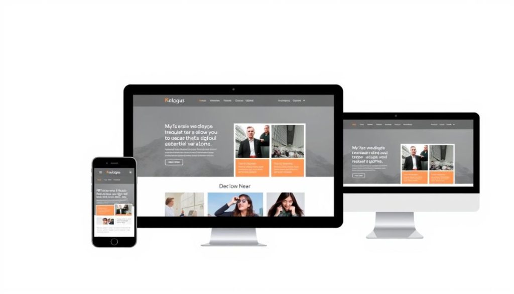
Container queries enable developers to style components based on the size of their parent container rather than the viewport. This approach provides more granular control over component styling.
The syntax involves defining a container using the container-type property and then applying styles based on the container’s size using the @container rule.
Container Queries vs. Media Queries
Unlike media queries, which rely on the viewport size, container queries respond to the size of their parent container. This difference allows for more precise and flexible component styling.
By using container queries, developers can create components that adapt to their context, making it easier to build responsive and reusable UI elements.
Real-World Applications and Browser Support
Container queries have the potential to simplify responsive design workflows and improve component reusability. As browser support expands, we can expect to see wider adoption of this technique.
Currently, container queries are supported in modern browsers, with ongoing efforts to improve compatibility and performance.
Modern CSS Techniques That Will Change How You Code
As I dive into the world of modern CSS, I’m excited to share techniques that are revolutionizing how we code. Modern CSS has introduced a plethora of features that simplify the coding process, making it more efficient and enjoyable.
The Power of CSS Custom Properties
CSS custom properties, also known as CSS variables, allow us to store and reuse values throughout our stylesheets. This feature is particularly useful for maintaining consistency across a website. For instance, we can define a brand color once and use it throughout our CSS, making it easier to manage and update our design. Some key benefits include:
- Easier maintenance of consistent design elements
- Simplified theming and customization
- Improved readability of CSS code
Logical Properties for RTL Support
Logical properties in CSS enable us to define styles that adapt to different writing directions, such as right-to-left (RTL) languages. This is crucial for creating inclusive and globally accessible websites. By using logical properties, we can ensure that our layouts and spacing are correctly adjusted for RTL languages, enhancing the user experience. Key aspects include:
- Using properties like margin-inline-start instead of margin-left
- Adapting padding and border styles for RTL languages
- Improving the overall flexibility of our CSS
Advanced Selectors for Cleaner Code
Modern CSS selectors offer more precision and flexibility, allowing us to target elements with cleaner and more efficient code. Advanced selectors like :is() and :where() can simplify complex selections and reduce the amount of CSS we need to write. Some benefits include:
- Reduced CSS code through more precise selections
- Improved readability with simpler selector syntax
- Enhanced maintainability of our stylesheets

Fluid Typography with clamp(): Creating Responsive Text
Fluid typography, achieved through the clamp() function, ensures that text remains readable and visually appealing across devices. This modern CSS technique allows for a more flexible and responsive design.
Understanding the clamp() Function
The clamp() function is a CSS function that allows you to define a value that is clamped between a minimum and maximum value. It takes three parameters: minimum value, preferred value, and maximum value. This function is particularly useful for creating responsive typography.
Building a Fluid Type Scale
By using the clamp() function, you can create a fluid type scale that adapts to the screen size. This means that your text will be readable on both small mobile devices and large desktop screens.
Optimizing Reading Experience Across Devices
With fluid typography, you can optimize the reading experience across different devices. The text size adjusts according to the screen size, ensuring that your content is always accessible and visually appealing.
CSS Grid and Flexbox: Modern Layout Techniques
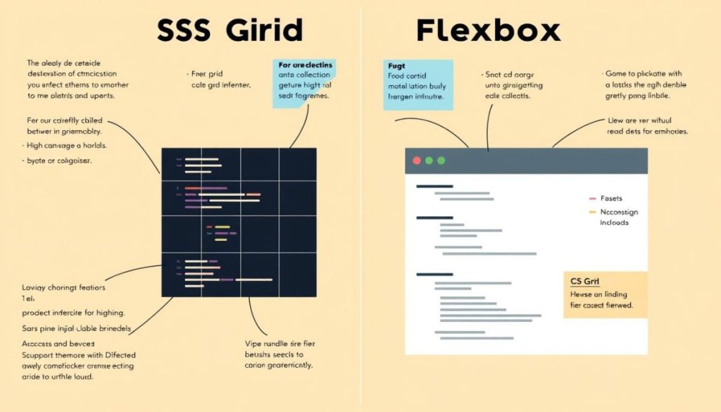
With the advent of CSS Grid and Flexbox, developers can now create complex, responsive layouts with ease. These modern CSS techniques have transformed the web development landscape, offering developers the tools needed to craft sophisticated and adaptable user interfaces.
Flexbox for Alignment and Distribution
Flexbox is particularly useful for aligning and distributing elements within a container. It excels at handling one-dimensional layouts, making it ideal for components like navigation bars or feature lists.
Grid for Two-Dimensional Layouts
CSS Grid, on the other hand, is designed for two-dimensional layouts, allowing for the creation of complex grid systems. This makes it perfect for overall page layouts or complex component structures.
Using Gap Property for Cleaner Spacing
Both Flexbox and Grid support the gap property, which simplifies the process of adding spacing between elements. This results in cleaner, more maintainable code.
By leveraging CSS Grid and Flexbox together, developers can create highly responsive and flexible layouts that adapt to various screen sizes and devices, enhancing the overall user experience.
CSS Transforms and Transitions: Creating Engaging Interactions
I’m excited to share how CSS transforms and transitions can elevate your web projects. By combining these techniques, you can create more dynamic and interactive user experiences.

2D and 3D Transforms Explained
CSS transforms allow you to manipulate elements in both 2D and 3D space. 2D transforms include functions like translate(), scale(), and rotate(), while 3D transforms add depth with functions like translateZ() and rotateX().
Creating Smooth Transitions
Transitions enable you to control the speed and timing of CSS property changes, making interactions feel smoother. Use the transition property to specify the CSS properties you want to animate and the duration of the effect.
Performance Optimization Tips
To ensure optimal performance, focus on animating properties that don’t trigger layout or paint, such as transform and opacity. Additionally, use the will-change property to hint to the browser about upcoming changes.
Advanced Color Techniques in CSS
As we dive into the world of modern CSS, advanced color techniques play a crucial role in enhancing web design. The latest CSS specifications have introduced new ways to handle colors, making it easier for developers to create visually appealing and accessible interfaces.
Modern Color Functions: rgb(), hsl(), and oklch()
CSS now supports advanced color functions like rgb(), hsl(), and oklch(). These functions provide more flexibility and precision in color selection.
- rgb(): Defines colors using the red, green, and blue model.
- hsl(): Defines colors based on hue, saturation, and lightness.
- oklch(): A more advanced color model that provides better color accuracy.
Creating Dynamic Color Systems
Dynamic color systems can be achieved by leveraging CSS custom properties and the new color functions. This allows developers to define a color palette that can be easily modified and applied across the website, enhancing maintainability and consistency.
Color Accessibility Considerations
When implementing advanced color techniques, it’s crucial to consider color accessibility. Ensuring sufficient contrast between text and background colors is vital for readability. Tools like WCAG guidelines can help in determining accessible color combinations.
CSS Blend Modes and Shape Effects
CSS blend modes and shape effects are revolutionizing the way we design and interact with web content. These modern CSS techniques enable web developers to create visually appealing and interactive user interfaces.

Using background-blend-mode and mix-blend-mode
The background-blend-mode property allows multiple background images to be blended together, creating complex and intriguing visual effects. On the other hand, mix-blend-mode blends an element with its parent, enabling sophisticated design elements.
For instance, using background-blend-mode, you can combine a texture with a solid color background, producing a unique visual appeal.
Shaping Content with shape-outside
The shape-outside property allows content to wrap around a floated element in a non-rectangular shape, enhancing the layout’s creativity. This property is particularly useful for creating magazine-like layouts or wrapping text around irregular shapes.
By using shape-outside with a floated image, you can achieve a more dynamic and engaging content presentation.
Adapting to User Preferences with CSS
As we continue to enhance user experience, adapting to user preferences with CSS becomes increasingly important. This involves using CSS techniques to respect user settings, such as dark mode and motion preferences, to create a more personalized and accessible web environment.
Implementing Dark Mode with prefers-color-scheme
The prefers-color-scheme media query allows us to implement dark mode based on the user’s system settings. By using this query, we can define styles that switch between light and dark themes. For example:
- Define a light theme as default
- Use
@media (prefers-color-scheme: dark)to override styles for dark mode - Apply the styles to relevant elements, such as background colors and text colors
This approach ensures that our website respects the user’s preference for light or dark themes, enhancing readability and user comfort.

Respecting Motion Preferences with prefers-reduced-motion
The prefers-reduced-motion media query is used to detect whether a user has requested reduced motion. This is particularly useful for users who experience motion sickness or prefer less dynamic content. By wrapping animations and transitions within this query, we can significantly improve the user experience for those who need it.
For instance, we can disable or simplify animations for users who prefer reduced motion, ensuring that our site remains engaging yet accessible.
Simplifying Complex Selectors with :is() and :where()
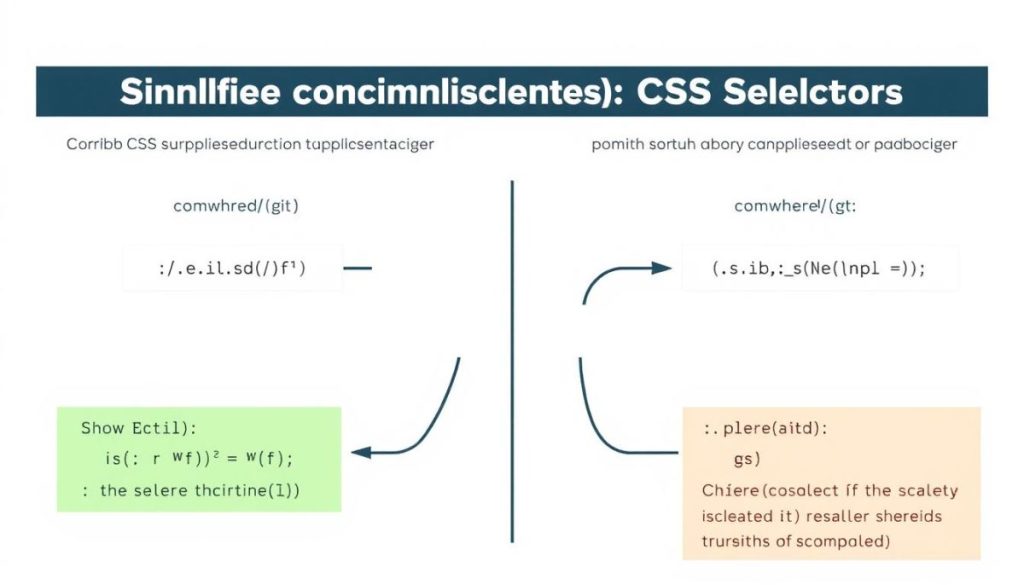
Simplifying complex CSS selectors has just become a lot easier with the :is() and :where() pseudo-classes. These modern CSS techniques allow developers to write more concise and readable code, reducing the complexity of stylesheets.
Understanding Specificity Differences
The :is() and :where() selectors differ primarily in their specificity. The :is() pseudo-class takes on the specificity of the most specific element in its argument list, whereas :where() has a specificity of zero. This distinction is crucial when deciding which selector to use in different contexts.
For instance, when you need to override existing styles, using :where() can be particularly useful due to its zero specificity, making it a powerful tool in your CSS toolkit.
Practical Use Cases for Modern Selectors
Both :is() and :where() can be used to simplify complex selectors. For example, instead of writing multiple separate selectors for styling a navigation menu, you can use :is() to group them together, making your CSS more efficient and easier to maintain.
A practical use case for :is() could be styling various header elements (h1, h2, h3) within a specific container with a single rule, enhancing code readability.
Conclusion: Embracing the Future of CSS
The advancements in CSS are not just about styling; they’re about creating a more dynamic and responsive web. As we’ve explored, modern CSS techniques such as container queries, fluid typography, and advanced color functions are transforming the way we approach web development.
By embracing these modern CSS techniques, developers can create more efficient, adaptable, and user-friendly interfaces. The future of web development is rooted in these advancements, and staying updated is crucial for success.
As we move forward, it’s essential to continue exploring and adopting these innovations to stay ahead in the field. With the right application of modern CSS, the possibilities for web development are endless.


